本文翻译自:Grid Spacing on Android 原文作者:Cyril Mottier
在大部分的移动UI或者Web UI都是基于网格概念而设计的。这种网格一般都是有一些对其的方块组成,然后它们组合成为一个块。使用网格这样的设计原则可以有助于对齐UI元素,提升UI的一致性,同时还能让用户更加容易的获取UI上面包含的内容。简而言之,网格是一个相当的强大的设计工具。
开发者在使用网格设计原则的时候需要在UI 元素之间添加一些额外的间距,比如padding、margin或者spacing(根据你的设计方案来选择使用哪种间距) 。这些间距有利于在不同的块之间设置清晰的分隔带同时不会整体UI的可读性。这些间距对我们Android 开发者来说也不陌生,我们在设计Android 界面时,也会使用View 的padding 和 margin 来达到类似的效果。在Android 开发中,为了将UI 和业务逻辑分隔,我们会使用 XML来定义UI。这种做法对于比较固定的UI很有效果,但当这些UI元素需要根据业务逻辑来确定隐藏或者显示的状态时,这种做法就有点困难了。这篇文章就根据这种情况提出了一些Android开发技巧来应对动态的网格UI。
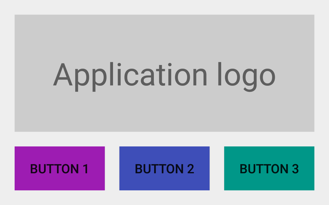
没有间距的UI
首先让我们来看一个简单的例子。我们创建一个简单的 LinearLayout 。然后我们在TextView (显示“Application logo”)下方再内置一个 LinearLayout ,我们在其中水平依次放置3个Button。最后得到的效果图如下图所示:
<LinearLayout xmlns:android="http://schemas.android.com/apk/res/android"
    android:layout_width="match_parent"
    android:layout_height="wrap_content"
    android:orientation="vertical"
    android:padding="@dimen/spacing_medium">
    <TextView
        android:layout_width="match_parent"
        android:layout_height="128dp"
        android:background="@color/light_gray"
        android:gravity="center"
        android:text="@string/application_logo"
        android:textAppearance="@android:style/TextAppearance.Material.Display1" />
    <LinearLayout
        android:id="@+id/buttons_container"
        android:layout_width="match_parent"
        android:layout_height="wrap_content"
        android:orientation="horizontal">
        <Button
            android:id="@+id/btn_first"
            android:layout_width="0dp"
            android:layout_height="wrap_content"
            android:layout_weight="1"
            android:background="@drawable/purple"
            android:text="@string/button_1" />
        <Button
            android:id="@+id/btn_second"
            android:layout_width="0dp"
            android:layout_height="wrap_content"
            android:layout_weight="1"
            android:background="@drawable/indigo"
            android:text="@string/button_2" />
        <Button
            android:id="@+id/btn_third"
            android:layout_width="0dp"
            android:layout_height="wrap_content"
            android:layout_weight="1"
            android:background="@drawable/teal"
            android:text="@string/button_3" />
    </LinearLayout>
</LinearLayout>

添加间距后的UI
上图的所展示的UI就是基于网格设计的。当时UI里面的元素之间都没有间距。为了让用户更好地区分这些UI元素,我们给id 为 @id/buttons_container 的 LinearLayout 添加属性 android:layout_marginTop="@dimen/spacing_medium" ;给id 为 @id/btn_first 和@id/btn_second 的两个 Button 分别添加属性 android:layout_marginRight="@dimen/spacing_medium" ;这时的UI效果如下图所示:

添加了间距之后,整体的UI效果好多了,可读性更强了。可当我们动态的隐藏某些 View 的时候就会出现一些问题了。我们假设第三个Button 会根据用户的设备是否安装了 Google Play Services 来决定它的展示。如果这个设备没有 Google Play Services,那我们就把这个 Button to View.GONE 的 visibility 属性设为 View.GONE, 所得效果如下图:

出来的效果与我们预料中的一样,第三个 Button 没有再显示了,但是第二个 Button 的右边没有与上面的TextView 右边对齐。出现这种问题的原因是:拥有 margin 属性的view 会认为margin相应方向存在邻接 view。例如,每个拥有right/top margin view会认为它的 right/top 方向有一个邻接 view,因此,这个对应 margin 也就会生效,就算这个邻接view已经隐藏了。
设置间距的折衷方案——Java 和 GridLayout
一个比较直接的解决方案就是在Java 代码里面手动改变相应的margin 值,但说实话这不是一个好的方案。另一个方案就是使用能够自动处理元素之间的间距的布局。GridLayout 就符合这样的要求。但是这个布局让人蛋疼的是元素之间的间距不能自定义,只能使用默认的间距。
设置间距的最佳方案——LinearLayout 的divider
实际上 LinearLayout 已经有一个处理这种元素之间的间距的属性了。这个属性却没怎么被大家发现,一直很低调,但它的效果相当神奇。所以我们说的第三个方案就是使用一个固定高宽的 Drawable 作为 LinearLayout 的 元素分隔线(divider):
<?xml version="1.0" encoding="utf-8"?>
<shape xmlns:android="http://schemas.android.com/apk/res/android"
    android:shape="rectangle">
    <size
        android:width="@dimen/spacing_medium"
        android:height="@dimen/spacing_medium" />
    <solid android:color="@android:color/transparent" />
</shape>
现在你就可以把这个新创建的 Drawable 设为LinearLayout 的 divider,这样这个Drawable 就能让元素之间产生间距了:
<LinearLayout xmlns:android="http://schemas.android.com/apk/res/android"
    android:layout_width="match_parent"
    android:layout_height="wrap_content"
    android:divider="@drawable/spacer_medium"
    android:orientation="vertical"
    android:padding="@dimen/spacing_medium"
    android:showDividers="middle">
    <!-- TextView -->
    <LinearLayout
        android:id="@+id/buttons_container"
        android:layout_width="match_parent"
        android:layout_height="wrap_content"
        android:divider="@drawable/spacer_medium"
        android:orientation="horizontal"
        android:showDividers="middle">
        <!-- Buttons -->
    </LinearLayout>
</LinearLayout>

总结
Android 框架里面有许多的特性可以用来实现一些不常见的方案,而且最后效果出其不意。定义 Drawable 就是其中一种途径。如果你能吃透Android 里面的 Drawable ,那么你的代码也可能大大地精简。
注意:文章LinearLayout的divider 属性设置是Android API 11 之后加进去的,这意味着Android API 11之前的设备要使用这个divider需要LinearLayoutCompat。